Layout and Purpose
Your HTML email’s layout should be anywhere from 600-800 pixels in width since many email clients provide a preview window that isn’t very wide. Simplicity is important, too. Don’t design an email as you would a website. Generally, the shorter your email is, the better it will perform. Email is increasingly read on-the-go, by busy people, on different types of devices. Write emails for a distracted audience, make it clear which content is most important, and make it easy to perform calls to action.
Single-Column Vs. Multi-Column
The type and amount of content you plan to send can dictate your email’s layout. Emails break down into two general layout types: single- and multi-column. Here are some pointers to help you decide which is best for your email.
Single-Column
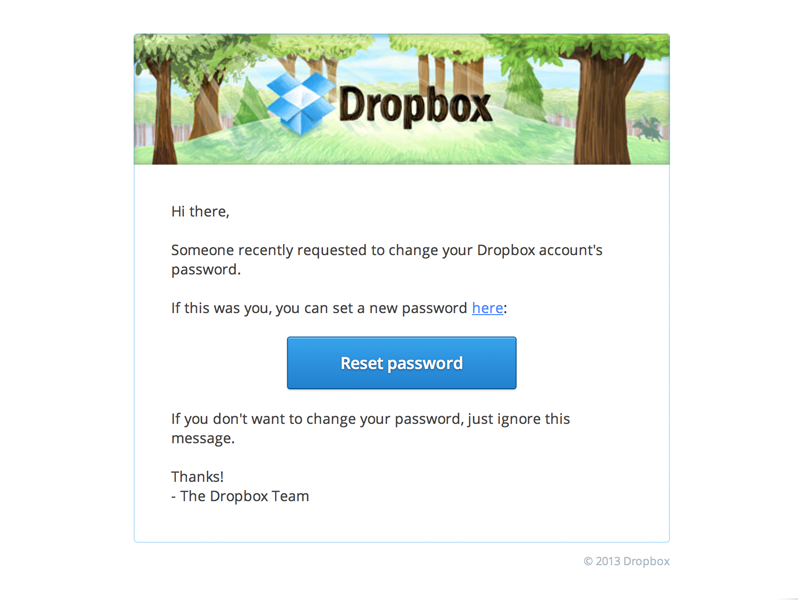
- Best for focused, succinct messages
- Tend to be easier to read than multi-column emails
- Best for emails requiring a call to action
Multi-Column
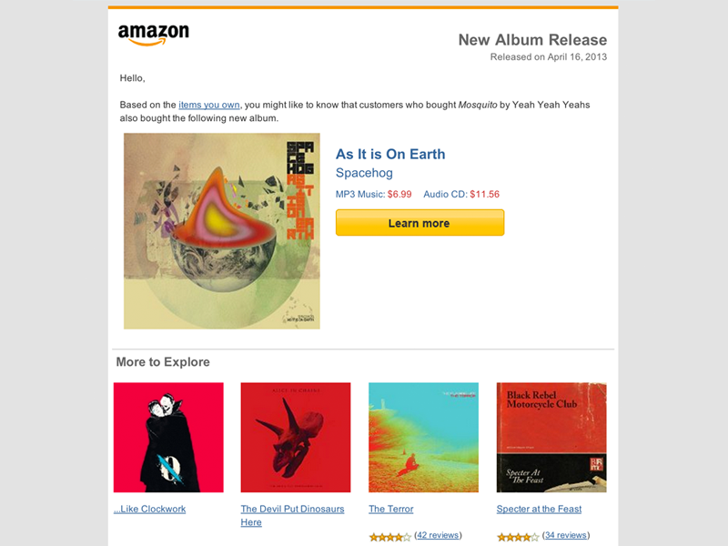
- Best for emails with wide variety of content
- Work well for product-based/e-commerce emails
- Best for emails which include non-crucial content best featured in a sidebar
These layouts can be used in a variety of ways to create interesting, effective email. There are plenty of great-looking examples in the Inspiration Gallery that you can use as a jumping-off point for your ideas.
Purpose-Built Email
Generally speaking, all HTML email newsletter fall into three broad categories: Read Me, Buy Me, and Join Me. Here are some tips for each type of purpose-built email.
Read Me
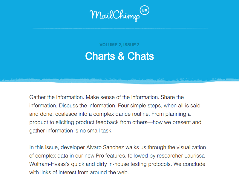
- These emails depend on good copywriting.
- They tend to be lighter in code weight thanks to a low number of images.
- Copy should be concise, easy to read.
- Typography is important. Font size and font family make a big difference in readability. (12px Comic Sans = bad. 16px Georgia = good)
- It’s important to have your “hook” at the top of the email, since mobile email clients may not download the entire message.
Buy Me
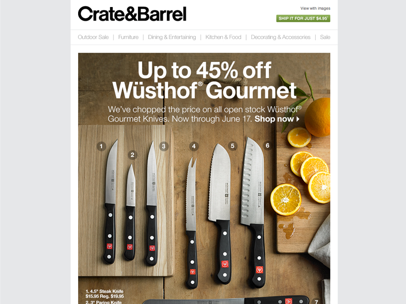
- These emails are dependent on interesting visuals (think: e-commerce product photos, etc.).
- Clear, well-cropped images are a must.
- Email images should have descriptive summaries, since clients often block images.
- Make it easy for a reader to get to your product’s page. Each product you advertise in the email should include a link.
- Well-written preheaders are important. Aside from the subject line, it’s the first thing people see in their inboxes.
Join Me
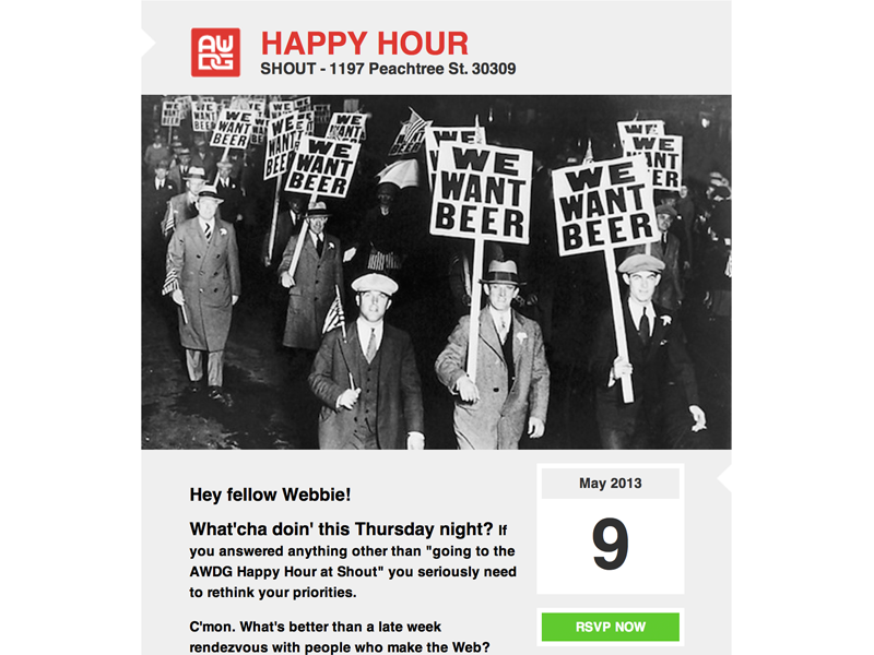
- These emails should be short and to-the-point
- Information hierarchy is very important. Event details should always be up top, prominent in size.
- If present, the call-to-action should be clearly-defined and easily discernible at a glance.
- Information secondary to the email’s main purpose (if it’s an invitation) should always come after event details and call-to-action.