Buttons
Whether you’re trying to sell computer parts, invite people to an event, or have money donated to a cause, buttons are a must if your email has a call to action. By and large, the two most popular ways to add buttons to an email are by using images or HTML. Each method has its pros and cons, but we’re concerned, here, with the HTML version.
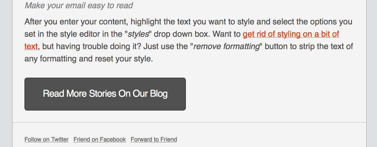
Adaptive-width HTML Button
For areas of your email that tend to be very wide, an adaptive-width button may be the best to use. This button’s width is dependent on the amount of text inside of the table cell.

<table border="0" cellpadding="0" cellspacing="0" style="background-color:#505050; border:1px solid #353535; border-radius:5px;">
  <tr>
    <td align="center" valign="middle" style="color:#FFFFFF; font-family:Helvetica, Arial, sans-serif; font-size:16px; font-weight:bold; letter-spacing:-.5px; line-height:150%; padding-top:15px; padding-right:30px; padding-bottom:15px; padding-left:30px;">
      <a href="http://www.mailchimp.com/blog/" target="_blank" style="color:#FFFFFF; text-decoration:none;">Read More Stories On Our Blog</a>
    </td>
  </tr>
</table>
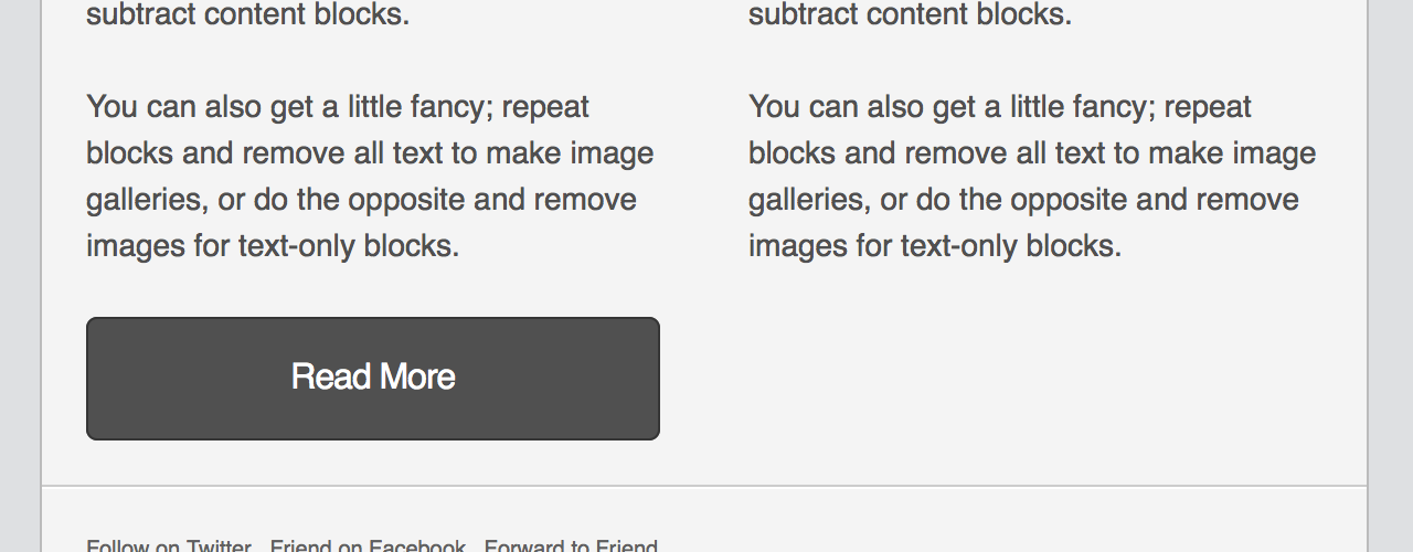
Full or Fixed-width HTML Button
Full or Fixed-width buttons are better-used in areas of your email that tend to be narrow, with sidebars and columns being the most common. The only difference between this button and the adaptive-width version is the presence of a width attribute on the button table.

<table border="0" cellpadding="0" cellspacing="0" width="100%" style="background-color:#505050; border:1px solid #353535; border-radius:5px;">
  <tr>
    <td align="center" valign="middle" style="color:#FFFFFF; font-family:Helvetica, Arial, sans-serif; font-size:16px; font-weight:bold; letter-spacing:-.5px; line-height:150%; padding-top:15px; padding-right:30px; padding-bottom:15px; padding-left:30px;">
      <a href="http://www.mailchimp.com/blog/" target="_blank" style="color:#FFFFFF; text-decoration:none;">Read More</a>
    </td>
  </tr>
</table>