Calls to Action
Calls to action can be a huge driver for email - often it may be the email’s only purpose, to get readers to perform a task. A good call to action should be persuasive and compelling. It should also be more descriptive than “click here”; use command verbs to make it clear just what clicking a link or button will lead to:
- Read More on The Blog
- Download the App
- Buy Now
- Order Yours
- Compare Prices
It’s also necessary to give readers a reason why they should complete your call to action. To that end, make sure that the content that’s directly related to the button or link is sufficiently explanatory and clearly shows the benefit of taking the action. Giving a call to action a sense of urgency can also help, though it’s a fine line between a sense of urgency and coming off as pushy - remember that not everything is as pressing to your readers as it is to you.
Buttons Vs. Links
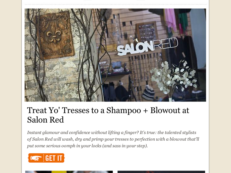
Buttons should be used for primary actions in an email. They’re the best way to define an item that requires reader action. They’re attention-grabbing and prominent:
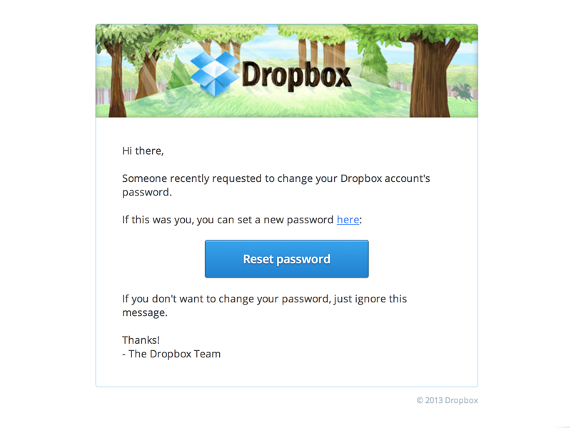
Buttons are difficult to miss even at a quick glance. You should exercise caution, however; you don’t want to litter your email with buttons. A button should be considered your ace-in-the-hole.
Links are best for non-crucial actions. For example, if your event email is pushing users to register, a bright “Register Now” button will perform much better than a link. But buttons aren’t always the best choice for a call to action, and in certain situations links can be just as effective:
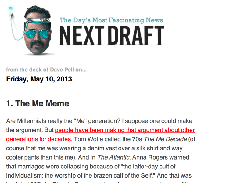
It’s easier to include links within the copy of your email so that, unlike buttons, they don’t cause the reader to come to an abrupt halt. On the other hand, that makes links easy to miss or forget unless they’re properly set apart from the rest of the email’s copy. An easy way to do that is to lengthen the number of words that a link covers. Instead of linking only the word ‘donate’ in a sentence, link an entire action or thought like ‘you can donate on our website’.
HTML Vs. Images
Generally, email buttons are done in two ways. They’re either built with HTML, or designed as images. Both methods have pros and cons, but we prefer (and urge you to prefer) HTML buttons. HTML buttons aren’t dependent on your email recipient having images enabled in their email client, which means that your call to action is always obvious. HTML buttons will load faster and they don’t vanish if an image server goes down. Those are the upsides. The downsides are more design-related: image-based buttons allow you to get more fancy, so you can achieve a much greater range of visual styles with an image-based button:
Anything Photoshop can do can be brought to bear on your button; drop shadows always work, letting you avoid having to deal with CSS3 drop shadows. It’s the same with gradients or rounded corners or typeface. But, again, because the buttons are image-based, they’re subject to the image-blocking that every email client does by default. As email goes increasingly mobile, keep in mind that images tend to slow things down when an email loads; HTML doesn’t.
The Squint Test
A quick way to determine whether or not your email’s main call to action is obvious is to perform the good ol’ ‘squint test’. If you or anyone else can pick out the call to action while squinting at the email, then it’s unlikely your readers will miss it either.
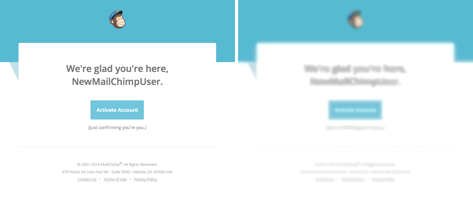
Just make sure you perform the squint test at your desk - it’s safer that way.