Mobile Friendliness
The internet’s been in “mobile everything” mode for a couple of years now, but as far as email is concerned, the idea is a little younger. Despite the fact that emails are still coded using the outdated table standard, it’s possible to create modern, mobile-friendly, responsive emails using the same principles we see applied to traditional websites.
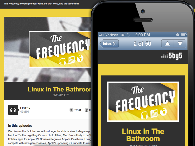
There’s a distinction to be made between “mobile-friendly” and “responsive,” however, since a mobile-friendly email is not necessarily responsive, and a responsive email is—generally speaking—always mobile-friendly.
Mobile-Friendly Email Attributes
- Can be fixed-width but still mobile-optimized. An email with a fixed width of 320px (the width of a phone screen in portrait orientation) is one example.
- Font sizes don’t change dependent on screen size, but are large enough to be readable on small screens.
- Can retain a multi-column layout while allowing for readers to tap and zoom into each individual block of content, for easier reading.
- Use large, thumb-tappable buttons for calls to action.
Responsive Email Attributes
- Use media queries to adjust email width dependent on the size of the display on which its viewed. That way, the email’s width adapts to any display size in any orientation.
- Font sizes change from desktop to mobile displays. Several different display sizes can be targeted using different media queries
- Layout can be changed from multi-column to single-column on the fly.
- Different elements (image-based buttons, for example) can be hidden and shown dependent on which platform the email is viewed on.
Best Design Practices
When designing mobile email, we try to follow the mantra “one eyeball, one thumb, and arm’s-length.” This means that, on a small screen, an email should be easily readable with one eye (The other one is presumably paying attention to traffic—don’t do this!), any links and calls-to-action usable with one thumb, and any text or visual cues large enough so that all of the above can be done comfortably at arm’s length.
Guidelines for achieving these objectives: * Minimum font size of 16px—Apple recommends 17-22px, Google recommends 18-22px. (We’ve found 16px Georgia to be nice and readable.) * Call-to-action touch targets, such as buttons, should be at least 46px squared (Apple recommends 44px squared, Google recommends 48px squared—we’re splitting the difference). * Avoid clustering several links together in your copy. It makes individual links very difficult to access.
These guidelines should get you started on crafting effective mobile emails, but if you need deeper insight, Mailchimp’s done some leg work on the subject and compiled it into a guide filled with insights.
Device Size Matters
Consider how people use their devices. Human behavior should definitely influence your designs; whether someone is viewing an email on a phone or tablet can lead to very different design choices. Start with how people hold their devices.
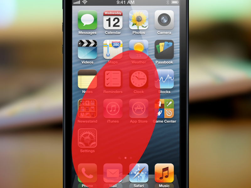
Phones are generally held in one hand and used with one thumb. The areas where it’s most comfortable to tap with the thumb are opposite of the user’s dominant hand (right-handed taps comfortably on left side of the screen):
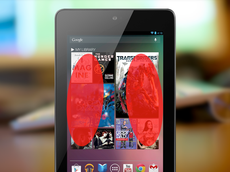
Tablets, on the other hand (Ha!), are generally held in two hands, allowing thumbs to reach touch targets on the sides on the screen, but not the middle:
Where possible, your designs should accommodate both scenarios. Consider having important calls-to-action like buttons span the full width of the email when its viewed on a mobile device. By doing so, you’re covering both right- and left-handed readers.
You can also go the extra step of providing multiple ‘break points’ for your design with media queries that target phones in landscape and portrait orientations, and provides similar solutions for tablets. At the very least, design an email that can scale down to a 480px width - the most common width of a phone in landscape orientation.
Should every email be mobile-friendly?
Yes.
Should every email be responsive?
Yes.