Adaptive Buttons
It can be helpful, in certain situations, to have an email’s button span the full width of the screen on mobile devices. While right-handed users are more comfortable tapping the left side of a phone screen with their thumbs, left-handed users are more comfortable tapping the right. In the case of a strong call-to-action, like a button, making it easy for anyone press can be beneficial.
Here’s a standard HTML button, and how it appears when an email is viewed on a desktop:
<table border="0" cellpadding="0" cellspacing="0" class="emailButton" style="border-radius:3px; background-color:#6DC6DD;">
  <tr>
    <td align="center" valign="middle" class="emailButtonContent" style="padding-top:15px; padding-right:30px; padding-bottom:15px; padding-left:30px;">
      <a href="..." target="_blank" style="color:#FFFFFF; font-family:Helvetica, Arial, sans-serif; font-size:16px; font-weight:bold; text-decoration:none;">Buy Now</a>
    </td>
  </tr>
</table>
Primarily, we want to change the button’s width on small screens, but it’s also a good idea to increase the text size and change the link to a block-level element:
<style type="text/css">
  @media only screen and (max-width: 480px){
    .emailButton{
      max-width:600px !important;
      width:100% !important;
    }

    .emailButton a{
      display:block !important;
      font-size:18px !important;
    }
  }
</style>
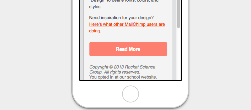
The code above results in a more usable and readable button: