Usable Link Groups
There are places in an email where a group of several links are clustered together. The most common example can be found in the footer of an email, where utility links like ‘view in browser’, ‘unsubscribe’, and ‘follow us on twitter’ often appear:

While these link groups don’t present a problem when an email is viewed on a desktop, they can cause issues on small screens; it’s often difficult to tap just one link in a group when you’re using a finger. This clearly presents a usability issue, not to mention the fact that it’s frustrating for users.
Luckily, with the use of media query mobile styles, we can provide an alternative. First, a look at the default html:
<table border="0" cellpadding="0" cellspacing="0" width="100%" id="emailFooter">
<tr>
<td align="center" valign="top" class="footerContent" style="padding-bottom:15px;">
© 2013 EmailCo, All Rights Reserved.
<br />
123 Atlantic Ave. • Atlanta, GA 30318 USA
</td>
</tr>
<tr>
<td align="center" valign="top">
<table border="0" cellpadding="5" cellspacing="0" id="utilityLink">
<tr>
<td valign="top" class="utilityLinkContent">
<a href="..." target="_blank">View in Browser</a>
</td>
<td valign="top" class="utilityLinkContent">
<a href="..." target="_blank">Terms of Use</a>
</td>
<td valign="top" class="utilityLinkContent">
<a href="..." target="_blank">Privacy Policy</a>
</td>
<td valign="top" class="utilityLinkContent">
<a href="..." target="_blank">Unsubscribe</a>
</td>
</tr>
</table>
</td>
</tr>
</table>
You’ll notice that the links themselves are in a separate, nested table; odd, we know, but there’s a good reason for it, which we’ll get to. First, here’s the default CSS:
<style type="text/css">
    .footerContent, .utilityLinkContent{
        color:#606060;
        font-family:Helvetica, Arial, sans-serif;
        font-size:13px;
        line-height:125%;
    }

    .footerContent a, .utilityLinkContent a{
        color:#6DC6DD;
    }
</style>
Everything is styled nicely, and using the cellpadding attribute on the nested table gives us a nice bit of spacing for the links. Great for the desktop, but the ideal solution for small screens is to place every link on its own line, and give them enough separation that they’re easy to tap:
<style type="text/css">
    @media only screen and (max-width: 480px){
        #utilityLink{
            max-width:600px !important;
            width:100% !important;
        }

    .utilityLinkContent{
            background-color:#E1E1E1 !important;
            border-bottom:10px solid #FFFFFF;
            display:block !important;
            font-size:15px !important;
            padding:15px 0 !important;
            text-align:center !important;
            width:100% !important;
        }

        .utilityLinkContent a{
            color:#606060 !important;
            display:block !important;
            text-decoration:none !important;
        }
    }
</style>
By giving them a background color, we’re essentially turning each of those link-containing <td> elements into buttons. We’re also bumping up the text size, setting the links to block-level elements, and changing some of the padding. By adding border-bottom to each <td>, and matching the color to the email background, we give the link buttons a little separation, as well. We end up with this result:
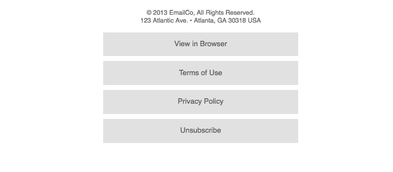
Each link is now easy to tap with a finger, and everyone’s happy.