Layout Manipulation
As we mentioned in Responsive Multi-column Layouts, using aligned <table> elements as columns allows for a lot of flexibility in terms of mobile layout. The clearest example of that is an email with a left sidebar and right main content area:
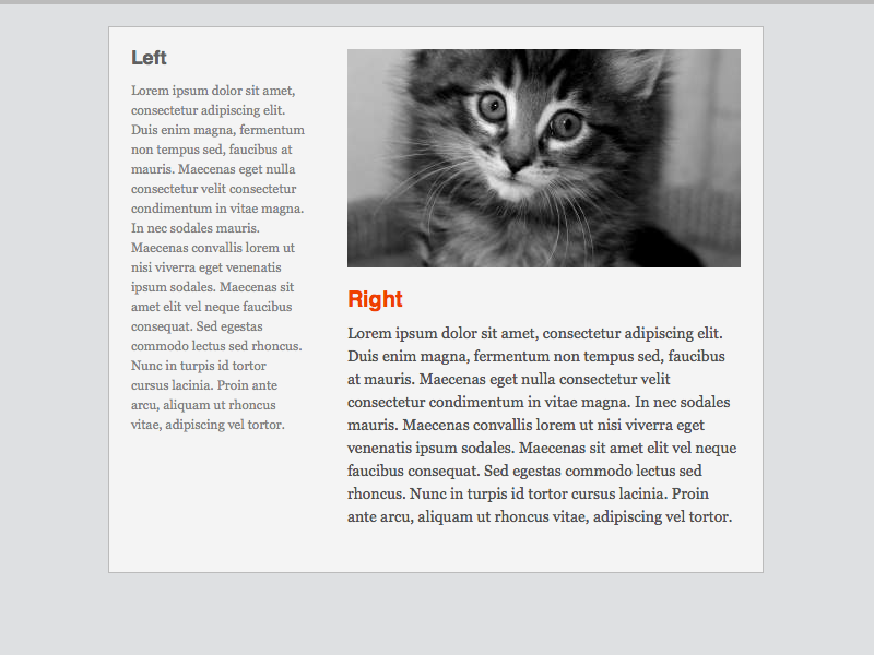
Layout switching in cases like this is very useful; generally, sidebars are for content that’s secondary in importance to the main body of the email. In the desktop view, the fact that the sidebar is to the left of the main content doesn’t really affect how you might read the email. On a small display, however, the sidebar would end up above the body, which doesn’t make much semantic sense:
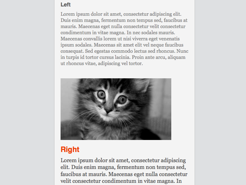
We can use the aligned <table> method to swap the order of the sidebar and body section and thus maintain proper semantic order when the email is viewed on a small display. The HTML is very similar to other responsive column layouts. The major differences are in the markup, where the sidebar and body are placed in a semantic order, and the align attribute directions on each table are opposite of their desktop-view positions:
<table border="0" cellpadding="0" cellspacing="0" width="600" id="templateContainer">
    <tr>
        <td align="left" valign="top">
            <table align="right" border="0" cellpadding="10" cellspacing="0" width="400" id="templateBody">
                <tr>
                    <td class="bodyContent">
                        <img src="http://placekitten.com/g/480/300" style="max-width:380px;" class="bodyImage" />
                    </td>
                </tr>
                <tr>
                    <td valign="top" class="bodyContent">
                        <h1>Body</h1>
                        Lorem ipsum dolor sit amet.
                    </td>
                </tr>
            </table>
            <table align="left" border="0" cellpadding="10" cellspacing="0" width="200" id="templateSidebar">
                <tr>
                    <td valign="top" class="sidebarContent">
                        <h2>Sidebar</h2>
                        Lorem ipsum dolor sit amet.
                    </td>
                </tr>
            </table>
        </td>
    </tr>
</table>
The media query CSS controls the width of each content area, along with the content itself:
<style type="text/css">
    @media only screen and (max-width: 480px){
        #templateSidebar,
        #templateBody{
            display:block !important;
            width:100% !important;
        }

        .sidebarContent{
            font-size:16px !important;
            line-height:125% !important;
        }

        .bodyImage{
            height:auto !important;
            max-width:480px !important;
            width:100% !important;
        }

        .bodyContent{
            font-size:18px !important;
            line-height:125% !important;
        }
    }
</style>
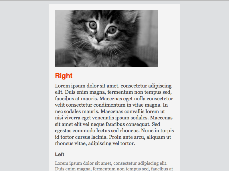
With the body placed on the left, but aligned to the right and the sidebar placed on the right and aligned to the left, the sections snap into place once the media query triggers:
The Outlook Problem
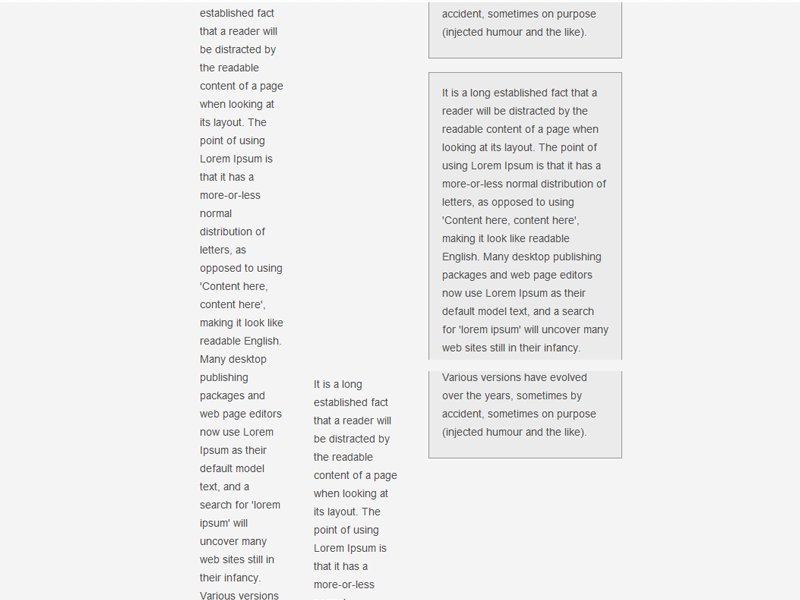
There’s a major problem with using this aligned table method, specifically having to do with Outlook’s 22 inch height limit on documents. When a document reaches this limit, around 1800 pixels in length, Outlook 2007 & 2010 oh-so-helpfully inserts a page break to aid with printing. That page break ends up being inserted between the aligned tables, which causes one to move under the other:
There’s no way to disable this “feature”; you’re relegated to finding work-arounds. We stick to two methods: emails with concise, short content so that they never hit that 22"/1800px mark, or conditional styling for Outlook, which can mitigate the issue and make it far less noticeable.